Visualization
Data visualization in FIND is performed mainly through the plotting area, which makes up the right side of the main program window.
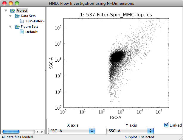
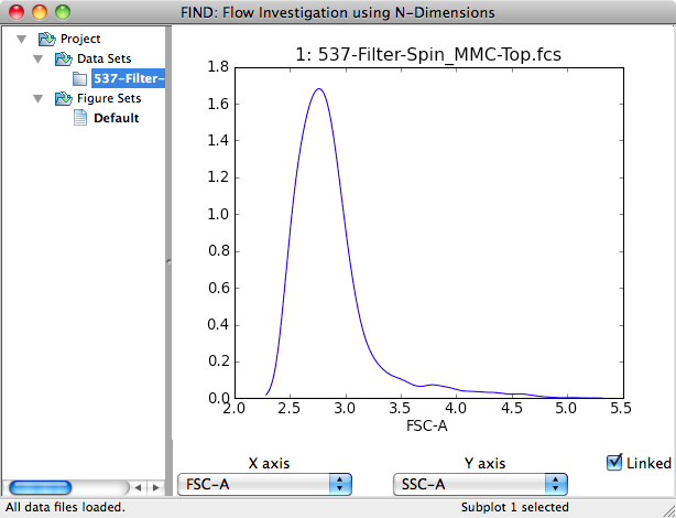
Here single data file has been opened, and a single 2D scatter plot
automatically created, visualizing the first two dimensions of the data as
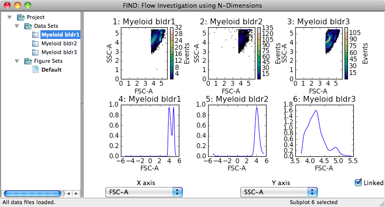
given by the file. If multiple files had been opened, the plotting area would
be automatically divided into n x 2 (rows x columns), where n is half
the number of opened files. The plots contained within the plotting area are
collectively referred to as a Figure, which will be explained in detail later.
Plotting Data
First select the plot (also called subplot) you want by clicking on it. Your choice is reflected in the far right section of the status bar (see images below). A new plot can be created in the selected plot space by accessing the Plot context menu available by right-clicking (or ctrl-click on OS X for single-button mice).
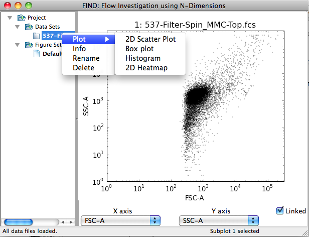
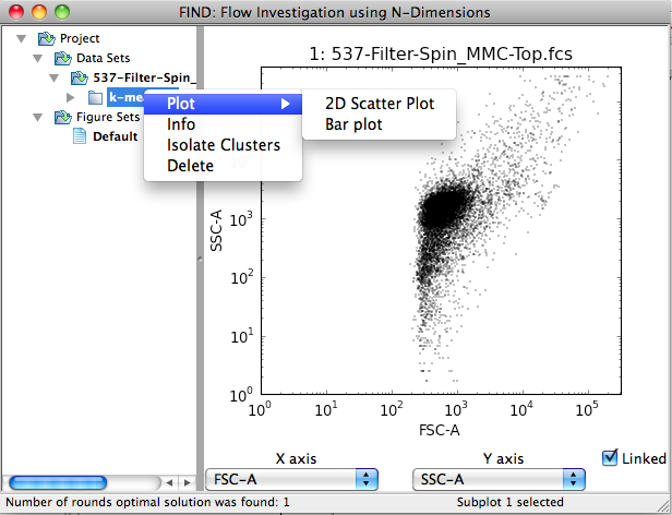
The above images illustrate the subdivision of plot types. Specifically, plots are grouped into those applicable to datasets and those applicable to clusterings.
Note
Plot types applicable to both data items show up in the context menus for both (e.g. 2D Scatter Plot).
Adding and Deleting Plots
A new plot space can be added by selecting the Plots>>Add Subplot menu item. The new space is automatically selected as the current and so is ready to be drawn to.
A plot (and its space) can be deleted through the context menu (right-click) for that specific plot.
Altering Plots
The main method of interacting with and changing the view of a plot is through
the Channel Selection panel beneath the plotting area. This panel contains
two dropdown boxes labeled X axis and Y axis (when 3D plots are added
a third for the Z axis will be added). Changing the selected channel (dimension)
automatically updates all the plots in the plotting area, with some exceptions.
Specifically, those plot types that display all dimensions at once, or are
otherwise not designed to change will not be updated. Additionally, individual
plots can be ‘unlinked’ from the selection panel. This involves first selecting
a plot by clicking on it (within the area it is drawn to). The selection is
confirmed by a change in the status bar at the bottom of the main window,
indicating Subplot n selected. Next, deselecting the checkbox marked
Linked causes the plot to be frozen as is with respect to the selection
of dimensions. For example, a series of plots (Figure) could be created
displaying all possible 2D plots of a dataset by creating one plot for each
possibility, and progressively unlinking and changing dimensions for each.
The second method of changing the display of an individual plot is through changing the plot settings, accessible through the context menu when right-clicking on a plot.
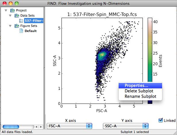
Selecting the Properties... menu item displays a settings dialog allowing you to alter the display or calculation with options specific to the plot type or general. Examples of each and more information are discussed in the following sections.
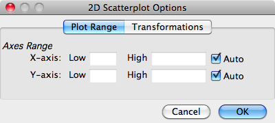
General Plot Properties
FIND provides two sets of general plot options that appear where appropriate
(and available to plugin authors). First, below, is the Plot Range options
panel. Here you can modify the graph window within which the data is displayed.
By default, FIND plots on both axes, a range from 0 to the maximum value of the
data plus five percent, i.e. (0, max(data) * 1.05]. This is indicated by the
selection of the Auto checkboxes.
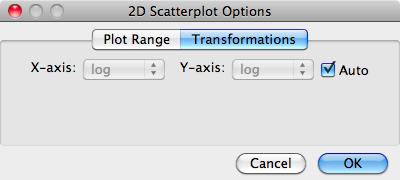
The second set of general options is the Transformations panel. This setting is initially set automatically by inspection of the data. FCS format files list the amplification type (linear or logarithmic) used to capture each channel of data, and FIND uses this information to decide whether the data should be displayed in a linear or log10 scale. In this options panel, you can tell FIND to either use automatically discovered information, or choose what scale the data are displayed in for each axis independently.
Dataset Plots
FIND currently provides four plot types for visualizing datasets: 2D Scatter Plot, Box Plot, Histogram, and 2D Heatmap. Each of these plots are explained in the following sections.
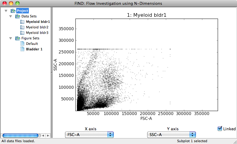
2D Scatter Plot
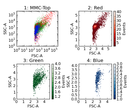
The 2D Scatter Plot draws a single point in two dimensional space for each event (cell) in the dataset. Below is an example plot of the Forward Scatter (x-axis) and Side Scatter (y-axis) on a log10 scale. As seen in the General Plot Properties section above, there are no options particular to the 2D Scatter Plot.
Boxplot
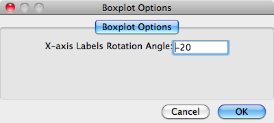
The Boxplot visualization is an example of a plot that is insensitive to user changes to the displayed channel, as it displays data for all channels at once. The x-axis here displays one tick-mark for each channel in the data, and for each channel a traditional box plot in the y-axis.
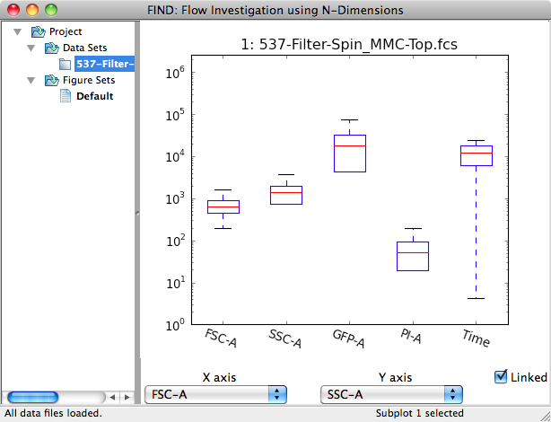
The only alterable properties for this plot (as seen below) is the angle to
which the x-axis labels are rotated, with 0 representing a horizontal
orientation. This is useful for datasets with many channels where FIND does not
adequately choose an angle that cleanly separates the labels.
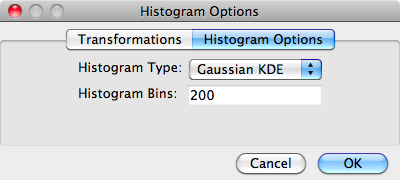
Histogram
The Histogram plot displays a single channel (x-axis) and, by default fits a Gaussian kernel to the data as an approximation to get the smooth curve seen in the image below.
The Gaussian kernel estimation gives a good representation of the overall shape of the data, but may not adequately estimate the amplitude. In the options for this plot, you can additionally select to display the histogram as a traditional binned plot separately, or overlay the estimation with the binned version via the Histogram Type option. Finally, you can set the fineness of the plot by changing the Histogram Bins option.
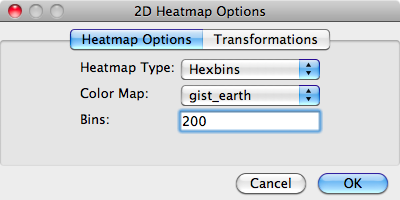
2D Heatmap
The heatmap plot is essentially a 2D histogram. It divides the plot into a set of hexagonal bins, only displaying a bin if it contains at least one data point. The density of points contained within the bin is displayed as a color map (heat map) with a scale bar on the right side of the plot.
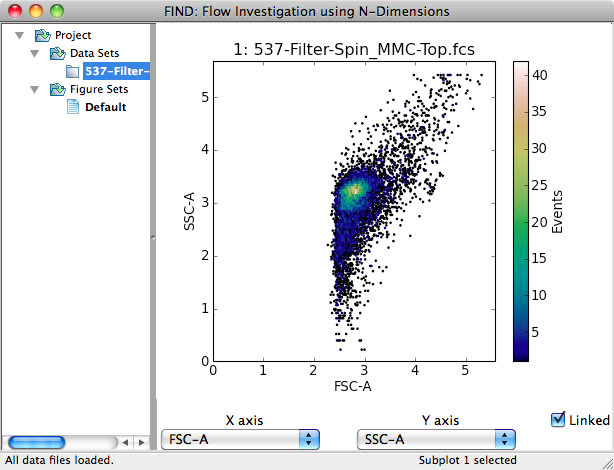
There are three (currently two) modifiable options for the 2D Heatmap. The Heatmap Type is currently under development and other options will eventually be available. The Color Map option sets the range of colors that are mapped to bin density from low to high. The default gist_earth (seen in the above image) is generally good, but other color maps may provide better visualization for sparse or especially dense datasets. The Bins option specifies the fineness of the 2D subdivision of the data points. Larger values may provide better insight into the data, but will take longer to plot.
Clustering Plots
FIND currently provides two plot types for visualizing clustering results: 2D Scatter Plot and Barplot.
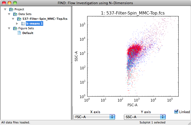
2D Scatter Plot
The only difference between the the 2D Scatter Plot as applied to a clustering as opposed to a dataset, is color. Each data point is colored according to cluster membership as seen in the image below. There are no plot-specific options.
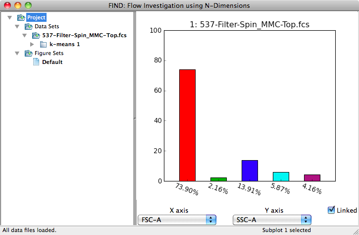
Barplot
This plot displays cluster membership counts in a vertical bar along the y-axis. Each cluster is a tick on the x-axis. The default y-axis value is the percentage of each cluster out of the total events in the parent dataset.
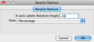
The Barplot comes with two plot-specific options. The first option allows you to change the rotation angle of the x-axis labels (similar to the Barplot). The View option changes the meaning of the y-axis values: the default percentage (as mentioned above), the percentage of the top level parent, and the total number of events in each cluster (no percentage).
Note
As will be explained in the section of the documentation on clustering, new dataset items can be created by isolating multiple or individual clusters. These new datasets appear as children of the original parent dataset. As these are dataset items just like those created by opening files, they can be clustered as well. So choosing the top level parent option for the View will calculate the percentage by making the denominator the number of events in the original parent dataset instead of the dataset the clustering was created from.
Figures
A Figure collects everything within and related to the plotting area. Specifically: all plots (and their settings) within the plotting area, the layout of the plots, the selected channels, and the linked/unlinked status of each plot.
The list of created Figures is in the Project tree (on the left side of the FIND window) under the Figure Sets group. At startup, FIND creates a single Default Figure that all plots will initially be created in.
If you want to rename or delete a Figure, access the context menu for it.
Note
There must be at least one Figure, and FIND will not allow you to delete the current (in bold) Figure.
Plotting Area Setup
The plotting area is organized into a rectangular grid. Initially, the grid layout and the number of plots is determined by the number of opened files, as discussed earlier. If you want to change the number of plots or the number of rows and columns, you must use the Plots>>Setup menu option.
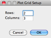
Below is an example of a 2 x 3 grid setup:
Creating Figures
A new Figure can be added through the Plots>>Add New Figure menu item. This will first ask you to type a name for the new Figure. Then the new Figure will appear in the Project tree. It is automatically selected (shown in bold), a single subplot is created and the currently selected data item is plotted by default with a 2D scatter plot (if it has a clustering, that will be plotted).
Switching Figures
If you have created multiple Figures, switching between them is as simple as clicking on the Figure item in the Figure Sets group. This action will completely replace the contents of the plotting area with the contents of the new Figure.
Note
For larger datasets (100K events or more) switching between Figures may take a few seconds since FIND has to recalculate and draw all plots saved into the Figure.
Exporting Figures
FIND enables you to save the contents of the plotting area to a number of standard image formats: PNG, PDF, PS (post-script), EPS, and SVG. To perform an export, use the Plots>>Export Figure... menu item. A save dialog will appear and ask you to specify the name of the file and the file type of the new image file. An example of a Figure export is below: